As a web designer, one of the hardest things to get from a client is information – be it statistics, contact information of people to speak to, text for a website, or good photos.
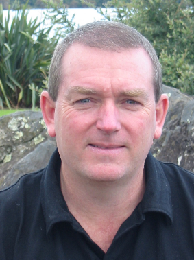
The headshot shown to the right here was taken in 2009 at Lake Pupuke, Milford. I know this detail years later because how I present myself to the world is important to me.
Let’s go through the details then of this shot in a way that you too can analyse your own resources such as your own marketing materials or perhaps your investigative target.
First, everyone will have some idea of how they want to be perceived. Don’t make the assumption that just because you are camera shy that your clients respect your problem.
Secondly, any photo is better than no photo! Websites without photos of the people show the public that you simply do not care. In general older people have less of a digital footprint and are more conservative with their private information but you would be surprised at what is available online when you look for it.
This photo is a casual look – my personal preference in lifestyle, but the look that I prefer for online photos is always a more formal one, mostly with a tie and business shirt, sometimes with a suit. This is important to me and I try to avoid people taking photos without my input or at a minimum getting a copy for myself.
This photo was taken in a strong overcast light but it was too much because I am squinting. This means that my eyes have strong crows-feet to the sides which are distracting. My hair and eyebrows are fine as is my neutral chin and neck position. A little slant to the right side of the photo brings a little interest but is probably unnecessary.
The background lake, flax and rocks are fine because they are out of focus, are relatively level, avoid the sky and do not distract too much. The back shirt is a casual shirt but because it is black this is not too noticeable and for me, is fine.
TIP 26:
Email is a fantastic tool to encourage writers to write. Slipping an email to someone you trust is a natural way to start to tell a story. Just write & click SEND. It doesn’t have to be perfect, nor any particular length nor formatted. Just think, write & send. Others can ‘tidy it up’!
My smile looks more like a grimace but it is better than nothing because my mouth is open and shows just enough teeth. No teeth showing is no good. Many teeth comes across as too unreal.
This was clearly not a professionally taken photograph but it is an acceptable image to use in many situations.
An important skill in investigative work is to consider details in photographs. Consciously look at all aspects of a photograph, not only the subject, but also the background.


Leave a Reply